How to Pick the Perfect Color Palette
paul halferty
Between choosing a layout, furniture, patterns and textures, there's a lot to consider when designing a home. And that's exactly why we're focusing on the fun part right now: Color

You would be hard-pressed to find anything more important to the design of a room than a color scheme that holds it together. The style of the furniture, the architecture, and the patterns of the room are all huge in determining the personality of a space, but nothing decides the feel of a room as much as the colors that you choose to fill them with.
Need help choosing your colors?
Home decor can be an art that can make us feel confused, stuck or frustrated, but there is a very simple way to come up with a balanced color palette that you will love for years to come: the 60-30-10 rule.

How Does the 60-30-10 Rule work?
You can begin by choosing three different colors: a main color, a secondary color, and an accent color, in a 60-30-10 ratio, respectively. This guideline is a good starting point for you to understand how to incorporate colors that will complement one another.
60% = Your Main Color
Your main color is that one that anchors the whole space, and it’s usually determined by the room’s largest elements, such as walls, large furniture, and fixed surfaces (such as a fireplace or cabinets). This color is most often a neutral, but of course there are exceptions.

In this Pasadena Great Room the neutral Linen of the walls, furniture, planters, and tile is our 60.
30% = Your Second Color
The second color in your space should be incorporated in a proportion that is about half of your main color. You’ll want this color choice to be different enough from your main color to create interest, but not so different that it creates huge contrast. Instead of competing for attention, they should feel harmonious.

The beautiful wood fireplace surround, table, flooring, and beams are our 30.
10% = Your Accent Color
Accent colors are typically your accessories, throw pillows, and art. Even though they make up only 10% of the space, an accent color often creates the biggest visual impact. THIS is where you have a beautiful opportunity to create bold contrast.

Notice how the green makes this room really pop!
Using a tried and true decorating rule can make your color choices so easy that you may wonder why everyone doesn’t follow it. The 60-30-10 rule is a very linear way to think about design, which sometimes can be so abstract. Just follow your percentages and you can't go wrong!

Are you ready to get started?
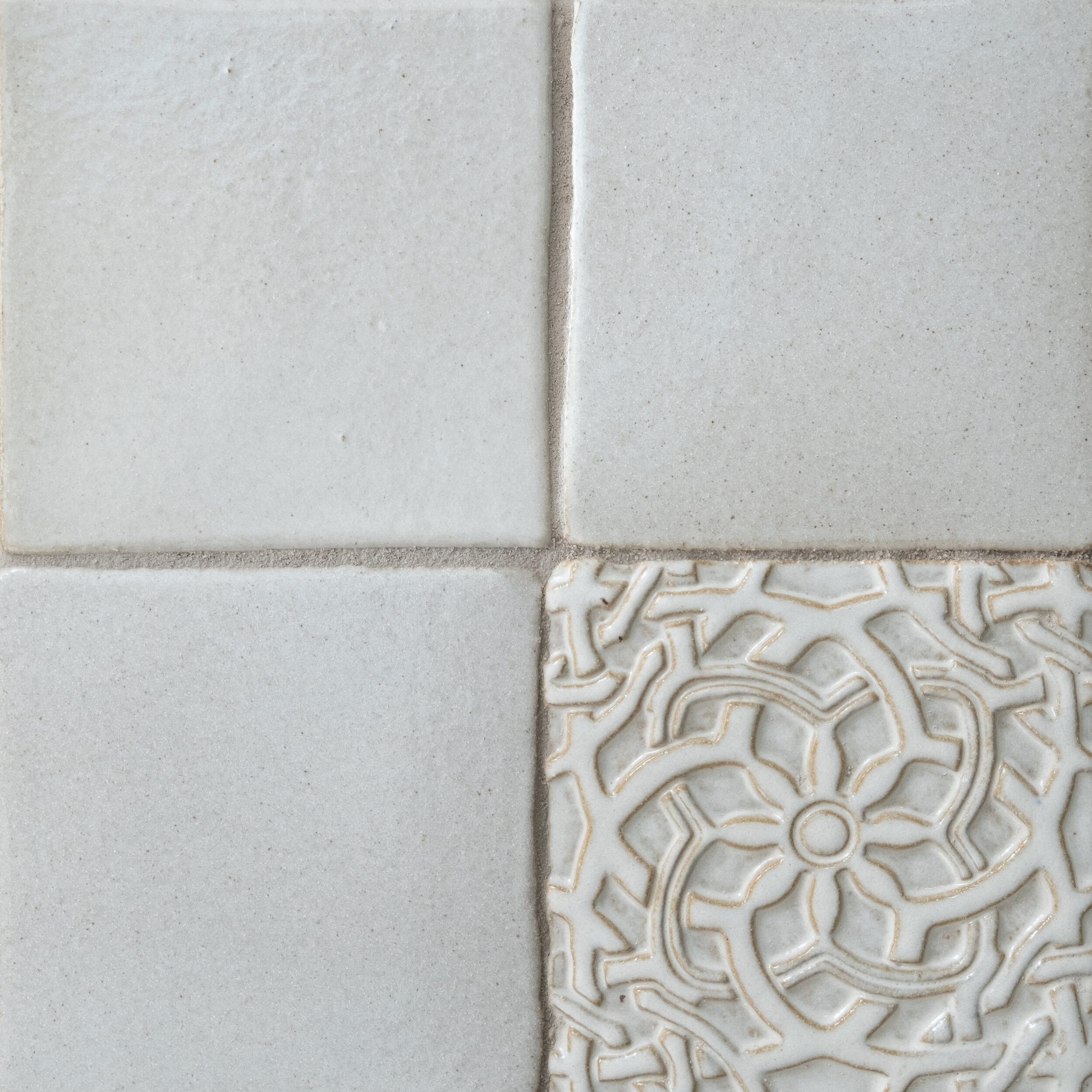
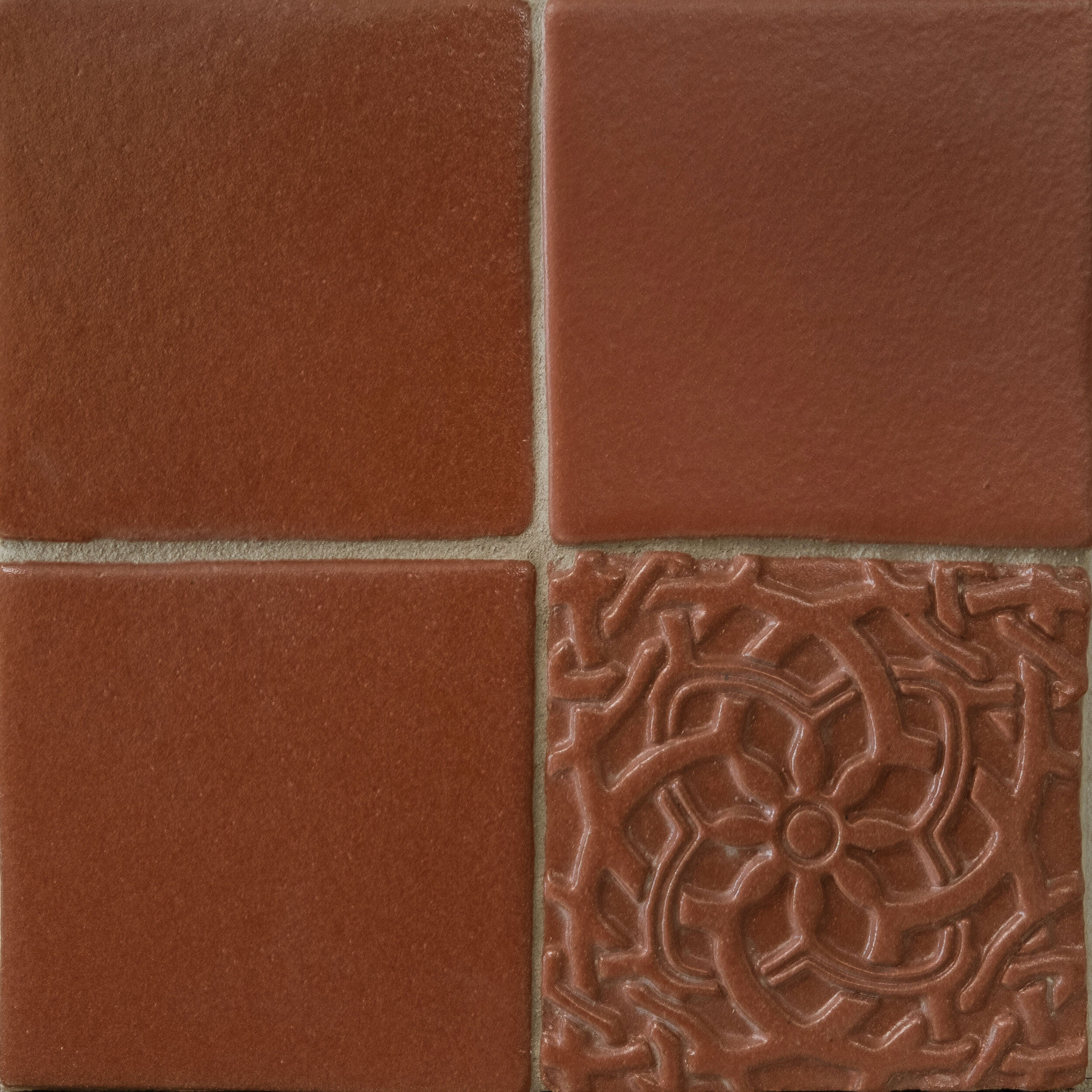
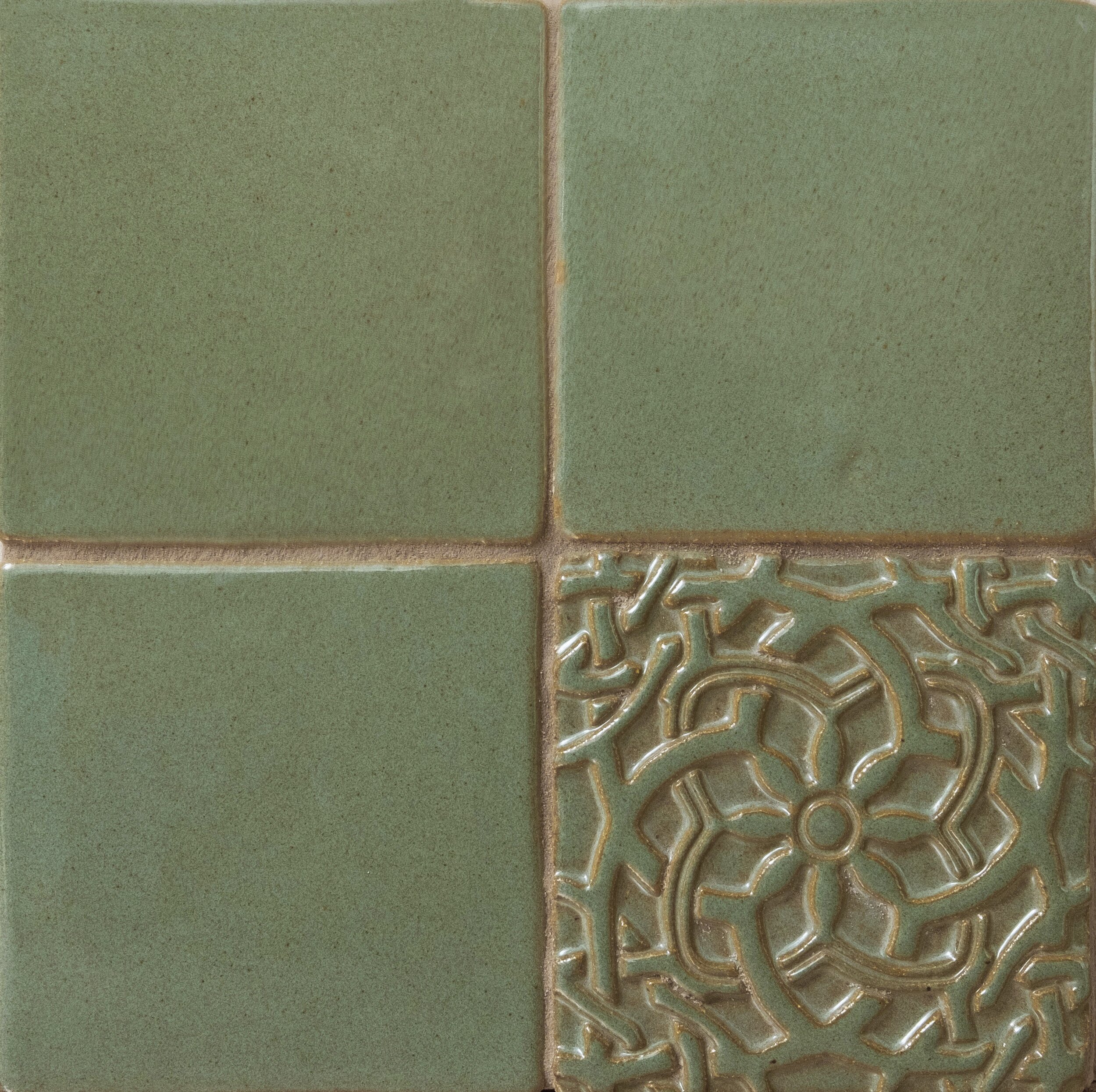
Tile is a great place to add color and contrast.

Shop Colors

Shop Patterns
Related Posts


Are you looking to bring energy, interest, and contrast into your kitchen? Color is often our go-to solution, but what about pattern?